
The Urban Outreach Center NYC
The Urban Outreach Center is a non-profit organization that aims at ending the hunger gap in East Harlem and the Upper East Side. They provide their guests with food and shelter and help them access social services. What differentiates The Urban Outreach Center from similar organizations is their focus on humanity and dignity, with their core values being hospitality, dignity, and justice.
Client:
- Urban Outreach Center
- March - May 2021
- Pratt dxCenter
Pratt Institute MS in Information Experience Design
My Roles:
- Stakeholder Experience Researcher
- Research Methodology Designer
- Copy Writer
- Graphic Design
My Team:
- Monica Hersher
- Hilary Wang
- Xiujie Bi
- Zhuolan (Leo) Zhang
Our goal
Help discover and implement potential changes aimed at inspiring, facilitating, and streamlining monetary donations and engaging younger audiences The Urban Outreach Center has inspired a steady influx of volunteers with volunteer opportunities being filled after only a fews days of posting. Due to the work that the UOC has done during the pandemic and the rapid rise in need of resources that the pandemic has caused, the visibility of the organization grew, which has inspired a further influx of people desiring to volunteer. Due to the restrictions put in place because of the pandemic, however, the UOC has found the facilitation of volunteers more difficult. Paired with the increased need for resources, the UOC has become increasingly in need of monetary aid. Through this partnership and project, the UOC wanted to increase donations and better engage younger audiences.
Methodology & Test Design
Participants were asked to "think aloud" as they carried out the assigned tasks, allowing us to better understand their actions and the underling causes and motivation.
Participant Selection
- Mobile participants: 6
- Desktop Participants: 4
Since the Urban Outreach Center's primary donor base is middle-aged women (40+) with college educations (and whom accessed the site through desktop browsers), while Urban Outreach aimed to inspire engagement from younger audiences, our team designed and conducted our test on two user groups: middle aged and above on desktop and younger audiences on mobile. This allowed us to discover usability issues and inefficiencies in content delivery as well as over user experience that pertained to younger users while also improving user experience for the current primary user group.
Tasks
Contextual Background:
Research on volunteers that I had conducted for INFO 634 Information Architecture on volunteerism revealed that volunteers and donors are primarily driven and motivated to engage by the mission and vision of the organization or cause and the visibility of the impact that their engagement—their actions, their contributions—will have.
Through this insight, we centered our tasks around the identification of any factors that prevented the impactful delivery of the mission of the Urban Outreach Center and the clear explanation of the impact that individual engagement has on cause.
Task 1
Take a couple of minutes to look at the homepage and learn about this organization without clicking on anything. What is your first impression of the website? Just a reminder to please narrate what catches your eye and what you're thinking. What do you think is the main mission of this organization?
Task 2
Can you tell me a few ways you can get involved with this organization? You can click on anything you'd
like now.
What are some impacts that your involvement could have in this organization? Which of these do you think
would have the biggest impact? Why?
Task 3
Now you want to make a recurring donation each month. Can you show me how you would do that? You won't
have to actually make any payments.
On a scale of 1-5 can you ate the difficulty of making a recurring donation 1 very easy - 5 very
difficult? Ask them to elaborate on their rating
Task reasoning
Since motivation to donate is based on messaging about the cause and the impact, tasks 1 and 2 were designed
to identify any inefficiencies in content delivery, information architecture, and overall user experience
design.
Task 3 was designed to identify usability issues in the donation process.
Findings & Recommendations
Overall, users were pleased with the aesthetics of the Urban Outreach Center site, describing the colors as
'soothing', 'easy to read', and advantageous for highlighting prioritized areas of engagement.
Other users appreciated the simplicity of the bolded mission summaries and calls to action, commenting on how
“the text draws you in”. As one user explained, seeing words like 'dignity' and 'volunteer' on the Learn page
helped me see that, “It's not just about feeding someone today, but about giving them the start of a better
life.”
However, in many cases, users reported getting lost in the scrolling of long pages, redundant menu options, and
inconsistent information
Finding 1
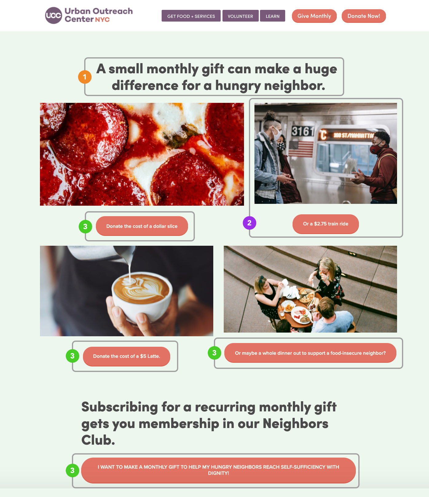
- The current page title “A small monthly gift can make a huge difference for a hungry neighbor.” does not highlight the impact of monthly monetary donations.
- Of the four images, the subway ride and button label “Or
a $2.75 train ride” do not align with the food
focus theme of the page and created some user confusion. This will solve two usability problems:
- Three participants expected that $2.75 would be an amount option on the donation form page or automatically populated. User 1, commented that “I thought the cost of the train ride $2.75 would be on the actual donation page.”
- Participants also associated the reference to a subway ride as a service that UOC provided to the homeless and low-income New Yorkers. Therefore creating confusion as to if their donation would be providing subway rides or monetary support for meal distribution.
- Similar to usability problem 2.a, participants expected the current amount in each button (four) label below each image to automatically populate in the donation form. Three participants found the five different buttons “redundant” since they took them to the same donation form.
Recommendation 1

- Highlight the impact of monthly donations, the researchers suggest adding language from the donation form page “$1=5 meals” to the “Give Monthly” page above the images. This will help imply that monetary donations will go towards providing meals to the Urban Outreach community in need.
- Remove the image of the subway ride and align the images of the pizza, the latte, and the meal.
- Turn the buttons into updated captions: “Donate the cost of a dollar slice”, “Donate the cost of a $5 latte”, “Donate the cost of a whole dinner out to support a food-insecure neighbor”
- One large button below the captions. “DONATE MONTHLY FOR A HUNGRY NEIGHBOR”
Finding 2

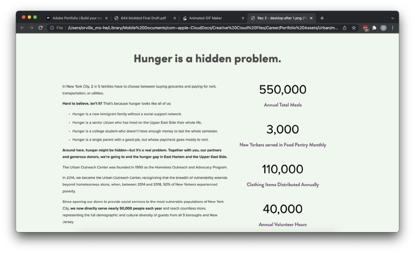
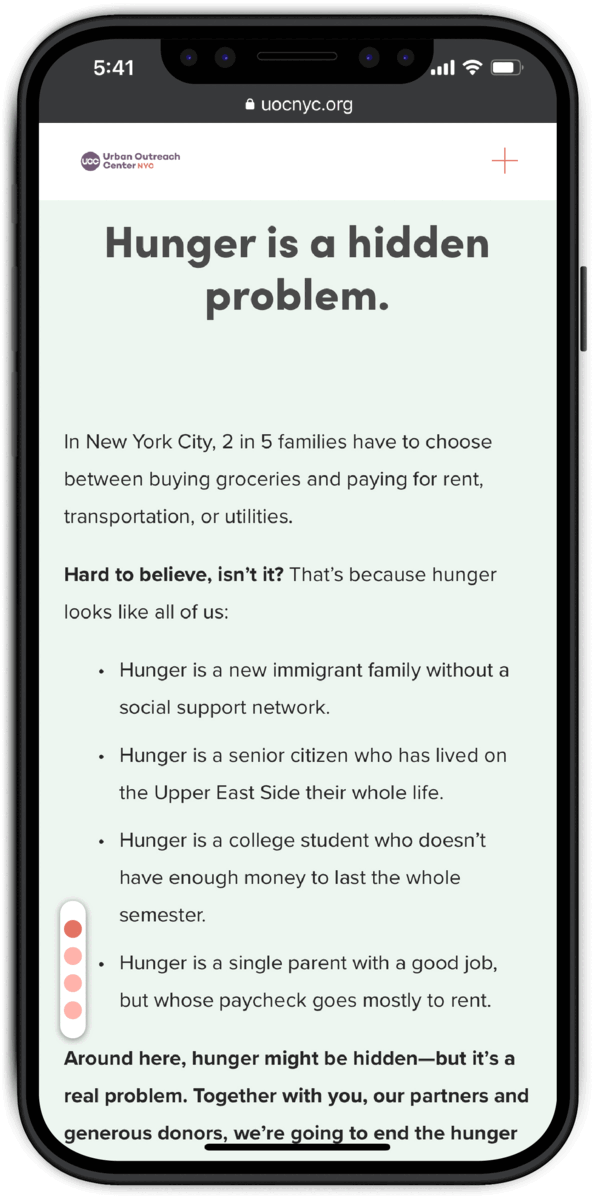
The current landing page lacks any form of signifier of the presence of more content being on the page.
Participants did not consistently scroll down on the homepage and later expressed that they did
not realize there was more content below, and that they did not realize could scroll down in the first
place.
As a result, participants were unable to identify the severity or the prevalence of the problem of hunger,
the impact that Urban Outreach has had, nor the process and stance taken by Urban Outreach.
Recommendation 2


Add an additional navigation menu to the left side of the page, that links to the different groups of content within each page.
The addition of these elements:
- Functions as a signal to the user that there is more content on the page prompting them to scroll or otherwise engage with the content
- Provide users with an overview of the contents of the page
- Allow users to more easily find and navigate to specific pieces of content or information.
Finding 3
The labeling and information architecture of homepage navigational buttons confused participants when searching for specific information.
The website was designed with large and clear buttons that create great call-to-actions moments for the users to both: get involved and get more information, however, several participants misinterpreted the meaning of buttons and found the hierarchy of information confusing. Specifically:
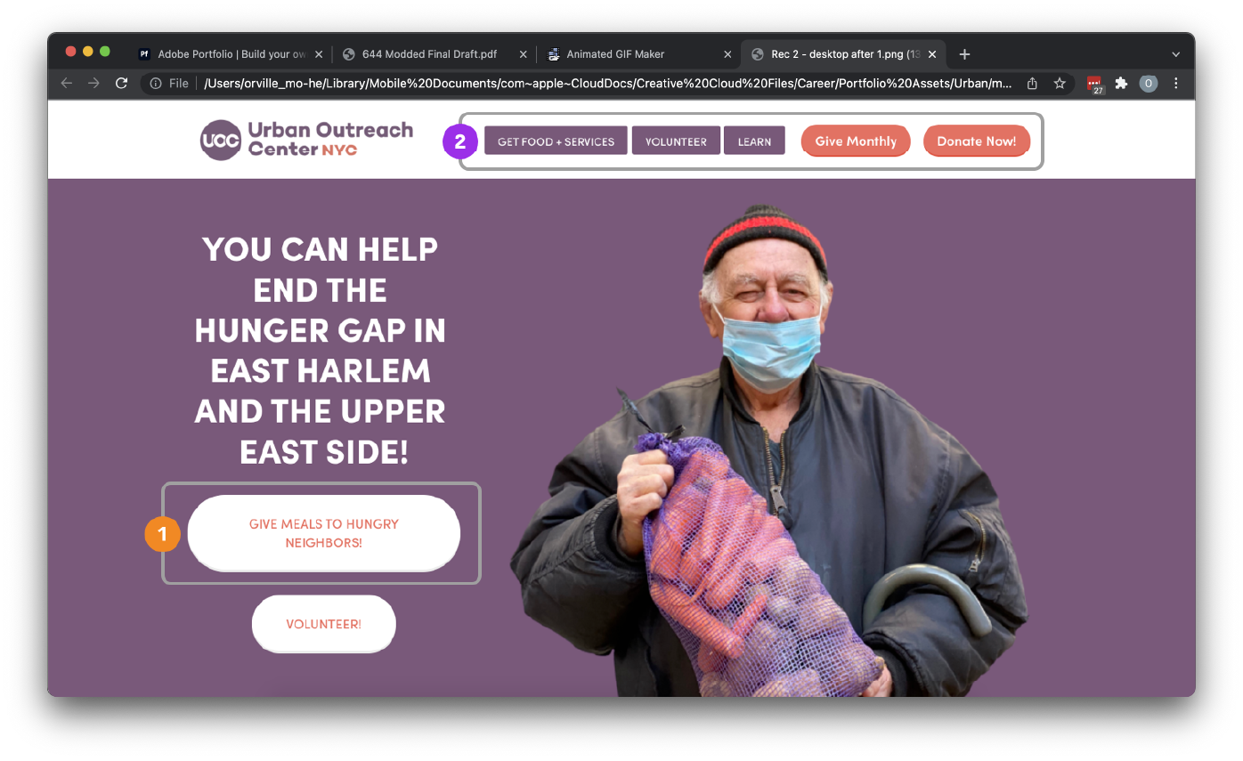
-
“Give Meals to Hungry Neighbors” button located in the center of the homepage was misinterpreted as a
volunteer opportunity instead of “General Donation”, where the button leads to. It caused confusion
about the difference between the “Give Meals to Hungry Neighbors” button and the “Volunteer” button
below.
“I thought that this (the “Give Meals to Hungry Neighbors” button) means that I can cook actual meals for them.”
–Mobile Participant 2 -
The buttons in the navigation bar serves two types of audience: people who want to learn more and get engaged with donation and volunteering and people who are looking for services. The grouping and labeling of these buttons confused participants when trying to access information when having a specific need in mind. Several participants did not consistently think to associate the “Learn” button with the mission and vision information provided.
Since the website serves mainly to those who are looking to learn more about the organization as well as to get involved, the hierarchy order of the buttons in the navigation bar should also follow the main purpose of the website.
Recommendation 3
To better the experience of a user trying to navigate and access information on the website, our team has synthesized the following recommendations according to our three findings:
- Relabel the “Give Meals to Hungry Neighbors” button to “Donate” or any wording that is easily understandable as a button that leads to the donation page so that people are welcomed to the homepage with two main options: donate and volunteer, to get engaged with the organization.
- Relabel the “Learn” button to “About Us” to ensure clear communication of the content that it is leading to. Prioritize the “About Us” button as the first button in the navigation bar as it is the introduction page for those people who are trying to learn more before getting engaged.
- Combine the two donation buttons: “Give Monthly” and “Donate Now” into one single button “Donate” as a way to group similar information.
- Clearly distinguish the content for different audiences (people looking to learn and engage and people looking for services) by grouping and styling the buttons “Learn”, “Donate”, “Volunteer” differently from “Get Food + Services”.
Big Problems with Quick Fixes
These were surface level problems with solutions that are easy to discover and implement, however, they were also catastrophic to usability and could not be ignored. We, therefore, consolidated them into their own section.
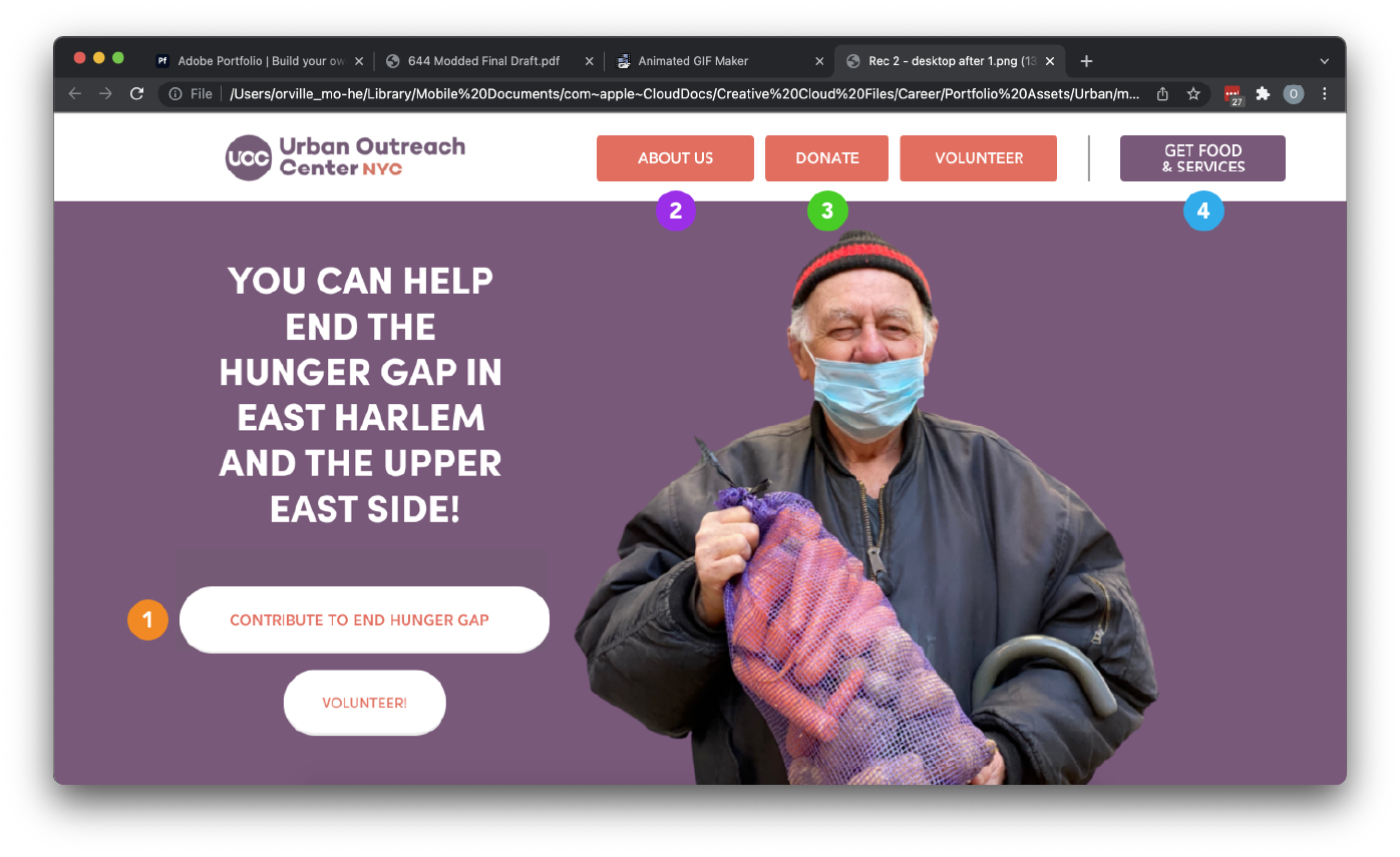
-
The opening picture is a neighbor with his mask under his nose. This has been commented on a lot and has been linked to the implication of poor handling of COVID-19 restrictions.
Use another photo.
(Note: Users have commented that they love the the smile and brightness of character of the person photographed, and that the fresh food they are holding really signifies that Urban Outreach is not only feeding the homeless, but feeding them well.” These points should be taken into consideration when retaking or re-choosing photographs.) -
The banner notification that tells users that they can “download the free guide now” covers the header and navigation menu on mobile and prevents users from navigating the site if they don't close the banner.
Move the banner to be under the header in placement and (as a redundancy) arrange the layering of content so that the header is on top of everything else.
-
The map button on mobile devices leads users to a page that locks them out of any kind of interaction with the site until they refresh.
This is an issue with the site's code. A workaround with out programming knowledge would be to make separate page, with just a map, that is only linked to the mobile map button and hidden on desktop versions.
Ideology
A motivation-based, antidark-pattern, antimanipulation approach towards engendering desired user actions.
Too often companies resort to dark patterns that exploit the psychology of their clients for monetary gain. Although during no part of the project was there a discussion on dark patterns or the like, and is, therefore, somewhat irrelevant, this project allowed me to use my research-based understanding of the target user group in order to develop solutions that catered to the users motivations and goals: realizing the needs of the project's client by helping realize the desires of the intended audience: their desire to make change.
byes~ thank you!